
Web design for ecommerce in 2026: what actually helps you sell more
Design choices that move ecommerce revenue in 2026. Layouts, typography, motion, trust signals, what actually converts on Webflow stores.
If you have an ecommerce store in 2026, your website design is not just about looking good. Design is what makes people trust you, understand what you sell, and feel confident enough to buy.
A lot of stores think they have a product problem or a marketing problem, but when you look closely, it’s often a design problem. The layout is confusing. The product page doesn’t answer questions. The photos don’t help people understand what they’re buying. The checkout feels like it belongs to a different website. And even if your product is great, people still leave.
So when we talk about web design for ecommerce, we’re not talking about fancy animations or trendy layouts. We’re talking about design that reduces confusion and helps people make decisions faster.
Key takeaways
- Good ecommerce design makes buying feel easy, not overwhelming.
- Your product page layout matters more than your homepage in most cases.
- Trust signals and clarity should be designed into the page, not added as an afterthought.
- Mobile design matters because most shoppers browse from their phones first.
- Consistency from product page to checkout is one of the biggest conversion levers in 2026.
What “web design for ecommerce” means?
Web design for ecommerce is the structure of your store and how people move through it.
It’s the way your product pages are organized, how your buttons are placed, how your photos are shown, how your information is written, and how your checkout feels. It includes the visuals, but the goal is not decoration. The goal is to make the experience feel clear.
A good ecommerce website design answers questions without making people dig. It helps shoppers compare options. It makes it obvious what to do next. And it removes the small things that create hesitation.
If your design makes people think too much, you lose sales. If your design makes it easy, you win.
Why ecommerce design matters more in 2026?
Ecommerce is crowded right now. People have too many choices, and most stores look similar.
At the same time, shoppers move fast. They scan. They bounce. They don’t read every word. They want the important information right away, and they want it to feel trustworthy.
Also, traffic sources have changed. People don’t only come from Google anymore. They come from Instagram, TikTok, creators, ads, email, and AI search summaries. That means your store has less time to convince them. You might get one shot.
So in 2026, design is your first impression and your sales tool at the same time. If your store looks clean, consistent, and easy to buy from, you convert more. If it feels messy or templated in a bad way, people leave.
The most important page in your store is usually the product page
Most brands put all their energy into the homepage, but the product page is where the money is.
Your product page is the page people use to make a decision. If that page is unclear, the visitor will leave even if they liked what they saw on social media or from an ad.
A strong product page layout should do a few things without forcing it. It should show the product clearly, explain what it is, explain why it matters, and remove the doubts people usually have. It should also make the next step obvious, like add to cart.
When product page design is done right, people don’t feel stuck. They feel guided.
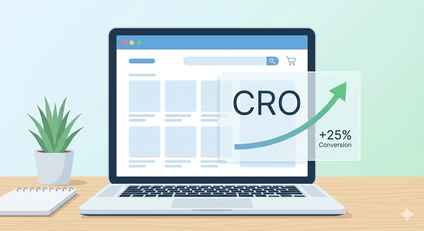
The design elements that improve ecommerce conversions
This is where design becomes CRO, even if you don’t call it CRO.
Clear hierarchy and scanning
People don’t read line by line. They scan. So you need clear headings, short sections, and spacing that makes the page easy to understand. If everything looks like one big block, people get tired fast.
Strong visuals and consistent images
Product photos should be sharp and consistent. If you show different angles or different colors, keep the style consistent. Messy visuals create doubt. Clean visuals create trust.
Trust signals built into the layout
Reviews, guarantees, shipping details, return policies, and secure payment badges should be placed where they reduce hesitation. If someone has to hunt for trust info, they leave.
Clear buttons and clear next steps
Your add to cart button should stand out and be easy to understand. And it shouldn’t compete with five other buttons. Too many options creates decision fatigue.
Brand consistency from page to checkout
If your checkout looks like a different website, people hesitate. Fonts change, spacing changes, tone changes, and suddenly it feels like they’re not buying from the same brand anymore. That trust drop is real, and it happens right before the purchase.
Mobile design is not optional in 2026
A lot of ecommerce browsing happens on mobile, and even when people buy on desktop, they often discover on mobile first.
If your mobile layout is hard to scroll, slow to load, or annoying to tap, people won’t wait. Small problems like buttons being too small or text being cramped are enough to kill the sale.
Mobile design should feel simple and smooth. Large tap areas. Clear product images. Short sections. Easy checkout. No clutter.
If your store feels good on mobile, you automatically open the door to more conversions.
What “good design” looks like for different types of ecommerce stores?
Not every store needs the same design.
If you sell something simple, like one hero product, your design should be focused and clean. Less scrolling, more clarity, and a strong story.
If you sell many products, your design should help people browse and filter fast. Good categories. Good search. Clear collections. Easy comparison.
If you sell premium products, your design needs to feel premium too. That means clean spacing, strong typography, consistent imagery, and checkout that feels high-end. If you sell premium but your checkout feels like a template, it hurts the trust.
The best design is the one that matches what you sell and how your customers decide.
Simple ecommerce web design mistakes that cost you sales
Some mistakes show up all the time, and they usually look small but they hit hard.
One is hiding key details. If people can’t quickly find sizing, shipping, pricing, or materials, they leave.
Another is making the page too busy. Too many colors, too many sections, too many popups. It becomes exhausting.
Another is a weak checkout experience. Too many steps, too many fields, or the design looks off-brand.
And one of the biggest ones is inconsistency. When the experience doesn’t match across the journey, shoppers feel like something is off, even if they can’t explain it.
Final thought
Web design for ecommerce is not art. It’s decision support.
Your website should help people understand what they’re buying and feel confident enough to check out. The design should feel consistent, clean, and intentional, especially on product pages and checkout.
If you want more sales in 2026, don’t only focus on traffic. Focus on what happens after the click. Because a well-designed ecommerce store converts better, keeps people longer, and makes every marketing channel work harder for you.
Try Penni Cart for Free and get your store live in minutes.
Related reading
- Ecommerce trends in 2026
- Webflow ecommerce conversion rates
- Top ecommerce website features
- Penni Cart pricing
Designing a Webflow ecommerce store for 2026? Browse Penni Cart components, cloneable cart, checkout, and product page sections that match your design system.
Related Articles


Webflow App